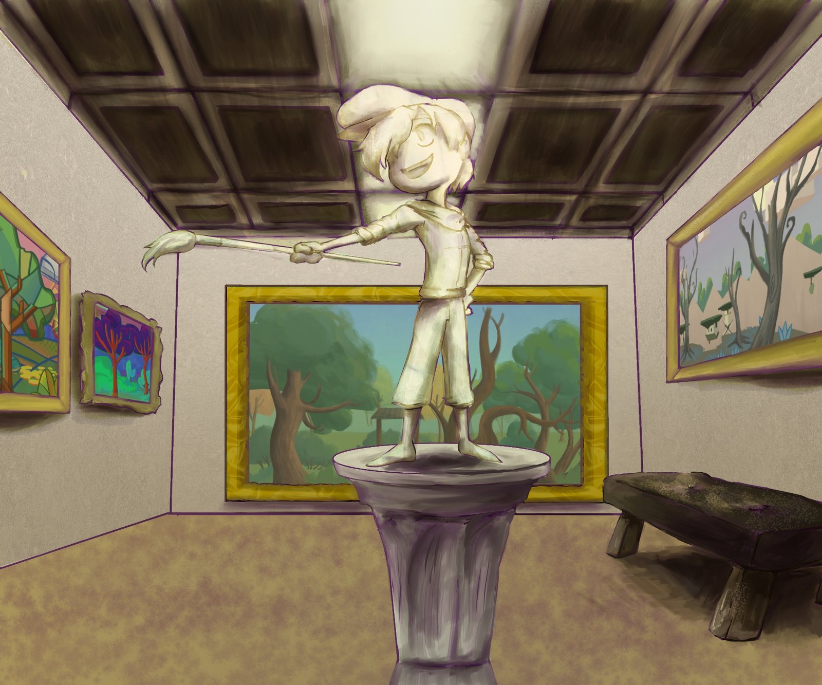
On the surface, The Painter’s Apprentice might look like a straightforward platforming game with a simple gimmick. In terms of the mechanics, that might be the case. What allows us to stand apart is our emphasis on art styles. You get to travel through different paintings based on Impressionism, Cubism and more. And, of course, there’s the attacking element where you must match your paintbrush color with the color of the enemy to defeat them. To many, this might seem a bit simple or basic. After all, there’s a lot more you can do with paint and colors, etc. We could have had different attacks attached to the different colors. Or maybe we could have added in more elements of painting where you draw your own platforms/paths to the end goal (*note to self for future game). I ended up going the simpler route because I love old platformers and I wanted this to be a bit of an homage to them, with my own twist.
Level Designing

With all that said, we wanted the overarching experience to feel like you were actually playing through these art styles. How would an Fauvism level feel? What about Surrealism? I researched the themes of each of the styles and realized that I could incorporate those into the level design. While some were certainly harder than others (Impressionism, I’m looking at you), the others fell naturally in place.
For example, Pop Art takes things from mass culture and then tries to show off the kitschy/banal elements of culture. While that would be difficult to really do in level design, I figured the closest we could get was to take levels from popular platforms and then place it in our game with our assets. Obviously it couldn’t be 100% exact, we had to have more obstacles and enemies, but the general layout should make people think that they’ve played something like the level before.
Other styles are more difficult. For example Fauvism is more about emphasizing strong colors over realistic values. That’s too abstract for level design. Instead, I looked at the term Fauvism, which means the wild beasts in French. Fauvism as a style was also very short-lived. Thus, I designed my levels to be short but also “wild” in that levels would have a lot of unpredictable obstacle and enemy placement.
Something like Impressionism is about depicting light as accurately as possible while providing interesting visual angles. Again, kind of hard to incorporate with level design. However, it’s also about the passing of time and movement, something that you can absolutely bake into how you approach each stage. I tried to emphasize this point as much as possible by making the levels a test in patience, of letting the time pass. Did it work? Not always. I also had to keep in mind the difficulty level. Impressionism is World 2 after all so it can’t be too difficult.
Sound Design
To really make sure players felt immersed in the art style the sound design had to be on point. I researched popular composers and styles of music during these styles and forwarded them to the composer. From there he was able to provide an amazing soundscape that could work just as well as a regular song track as it does in a game. Some soundtracks might seem like an odd choice. For example, we went jazz for pop art versus the more obvious pop/rock sound. Why? Well we wanted it to fit in smoothly with the rest of our smooth, classical tracks, but the 1960s were also a huge time for jazz with Charles Mingus, Dizze Gillespie, John Coltrane and more – so it fit.
Put together with the backgrounds and the level design, the music adds that additional layer to make the game feel like an experience rather than just a simple platformer.
Of course, there’s nothing wrong with seeing it as just a simple platformer either. So long as you have fun 🙂


