Tiles and UI Changes
These past couple weeks have been full of updates and changes and we’re pretty excited about them. We’ve made a lot of small changes to the UI, which will hopefully make the overall gameplay experience that much better. Most of these changes were to add some subtle animations to the menu so they “fade in” instead of simply appearing on the screen. It makes the menu system much more dynamic and fluid. As well we’ve darkened the icons for the menu and level select so you know when you have clicked a button. These small changes really have a huge overall impact on the look and feel of the game. We’re still working out a couple other things but you can check out the new system in the gif below:
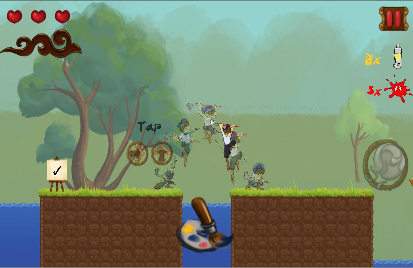
We mentioned in a previous post that we have gotten a new tile artist and we’ve switched over a lot of our old worlds to the new tiles. It’s made a huge difference in the way the game looks and for the better. On the design side, we have a lot more flexibility with our level design and can pretty much create almost every design we dream up (with a couple caveats of course). And since we have multiple tiles on a sheet, our game size should be much smaller than our previous method. Aesthetically, the levels are much more visually pleasing. There’s just the right amount of contrast to the background to really make foreground pop. You can check it out below.
[image-comparator title=”Tutorial Before/After” left=”http://luminositymobile.com/wp-content/uploads/2015/07/Tutorial.jpg” right=”http://luminositymobile.com/wp-content/uploads/2015/07/Tutorialnew.jpg” width=”100%” left_alt=”Before” right_alt=”After” classes=”hover”][/image-comparator]
[image-comparator title=”World 2 Before/After” left=”http://luminositymobile.com/wp-content/uploads/2015/07/World-2.jpg” right=”http://luminositymobile.com/wp-content/uploads/2015/07/World-2-new.png” width=”100%” classes=”hover”][/image-comparator]
If you’re in the NYC area, you can play our new and improved game on 7/29 at the Summer Expo. We’re still cleaning up a couple UI things but we’ve made a ton of improvements too so we’re super excited to show it off. As well if you’re in the DC/Baltimore area we’ll be at VGU convention August 1-2.
Luminaut Dev Log
Besides these UI changes, we’ve also completed some loading screens for the levels and we’ve updated some icons to keep with the painter theme more. We’ve finally fixed our double jump issue and now we’ve also added in the ability to jump once after you fall off a ledge so you can still save yourself. This makes the overall jumps feel much more responsive as previously if you tried to jump while falling off a ledge nothing would register. Plus, we’ve finally gotten the paint brush tip in-game to match the color you’ve chosen. It’s pretty great and serves as a great reminder of what you have “equipped.”
We’ve got a lot more updates coming your way. If you’re interested in testing out the build, subscribe to our newsletter and we’ll contact you first for closed beta testing.

